
Mobile-friendly site: How to build and test it
It is no longer new information that browsing the internet on mobile phones is much more common than browsing on a desktop computer (or laptop) – this has been the case for at least 6-8 years now.
This has slowly led to various algorithms (eg. search engines like Google) starting to adjust their operations.
It can now be stated that a well-functioning website is always mobile-friendly!
But what exactly does this mean in practice, how to make a site mobile-friendly, and what happens to all those who do not progress with these new demands?
The importance of having a mobile-friendly page
Since most online browsing is now done on mobile devices, it's a good idea to start by identifying what "mobile friendliness" means as a term.
"Mobile-friendly" means that the site can work just as flawlessly on a mobile device as it does on a desktop, laptop, tablet, or any other device and display size.
So users (and search engine crawlers) don't have unnecessary interactions to browse the page from mobile — no extra clicks, zooms, and zooms, rotations, or settings.
The mobile-friendly site is equally easy to use on any device!
However, it does not matter how we achieve this.
Responsive design
In recent years, Google has switched to mobile view, i.e. so-called "mobile first" indexing, which means that by default it uses the mobile version of websites to search for, scan and determine rankings in search results (SERPs).
This actually means that if a page isn't mobile friendly, you don't have much chance of getting good rankings in search results.
Mobile SEO is now synonymous with search engine optimization in the general sense.
But mobile-friendly operation can be accessed with a variety of technology solutions.
Google recommends that responsive web design is the best technological backdrop for mobile friendliness — but responsiveness isn't equal to mobile friendliness.
All responsive websites are mobile-friendly, but not all mobile-friendly sites are responsive.
Mobile friendliness can also be accessed with other technological solutions, such as:
- Dynamic serving
- Fully separated pages
However, if google reviews are important to us, it's a good idea to choose a responsive page.
A responsive web page looks like this in desktop view and on the phone:
But in addition to responsive web design, there are plenty of other things to look out for!


What are the criteria for creating a mobile-friendly website?
Layout
As shown in the image above, in mobile view the layout of a mobile-friendly website will be completely different from that of desktop view.
That's why it's always worth keeping in mind the small screen usability of different features.
A pop-up, for example, works great in desktop view because it only occupies part of the screen, but it's different on mobile because it completely covers the content, which can be very annoying.
However, pop-ups aren't the only things to avoid: mouse-over effects aren't the most optimal solutions for mobile, because while you can move your mouse cursor onto individual buttons, the human finger can only click.
In contrast, scrolling is perhaps one of the most important functions of mobiles, so make sure that it is done vertically and in no case horizontally, as this will break user flow, which will again only cause frustration.
For example, on a well-functioning mobile-friendly site, you can clearly see what is clickable (nicely separated CTA button), which way is it worth scrolling, what features are available (removable company logo, mobile-friendly menu) and is fully optimized for mobile use (no large images, videos that would slow down the page or generate unnecessary data usage).

Content
Content is, according to Google, one of the most important aspects when creating a mobile-friendly website, so it's extremely important that it's as easy to consume on mobile as it is on desktop.
The human eye, for example, likes "negative space" because it can relax on it. For example, the white spacing between sentences, or the bulky, neutral background color used on main pages.

It's important to keep these spaces on your mobile, otherwise your content may become overcrowded, causing users to leave the site much sooner, which is also detected by crawlers. The end result will be that we will find a worse position in search results.
Instead, make sure that key features, images, animations, videos, and text are readable and easy to browse over the phone — especially on subpages where content consumption is specifically targeted, such as a blog.
Speed
Speed is one of the most important mobile-friendly features a website can have.
It is important for multiple reasons:
- Page load time
- Data usage
In fact, the latter refers to the scope of the website, which is important because the large number of mobile users use the Internet when travelling, which consumes mobile internet. If our site uses too much data, users will be dissatisfied, as their mobile network may be severely depleted or even run out in its entirety.
For this reason, it's a good idea to keep the size of your web page low, so you won't have high data usage or data usage when loading individual subpages.
The other aspect is speed, because each extra second can bring with it a significant decrease in conversion.
That's why a well-functioning mobile-friendly website is built to load very quickly — in just a few seconds.
The good news is that by properly structuring the code and optimizing different website elements (e.g. images), a significant performance increase can be achieved.
Recently, for example, Coffee Stain – a mobile-friendly blog site for coffee – has achieved significant performance improvements in a few hours:


Speed is also a key factor not only for users, but also for crawlers, so with a few seconds of acceleration you can get really positive results in both conversions and search results!
Mobile-friendly test: How to check if your website is mobile-friendly
Because mobile friendliness is very important to Google, it has built its own tool that makes it very quick and easy to test whether a page really meets the criteria for browsing from your mobile.
All you need to do to complete the mobile-friendly test is to put the website URL in the Google app and in a few seconds you can see if it's mobile-friendly.
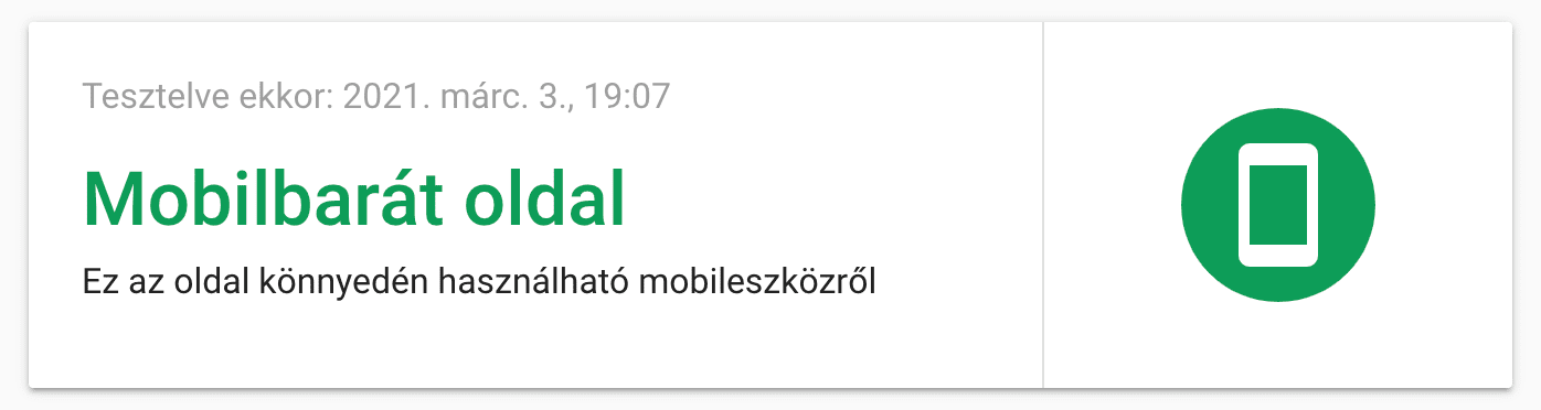
If a site is mobile friendly, you'll see:
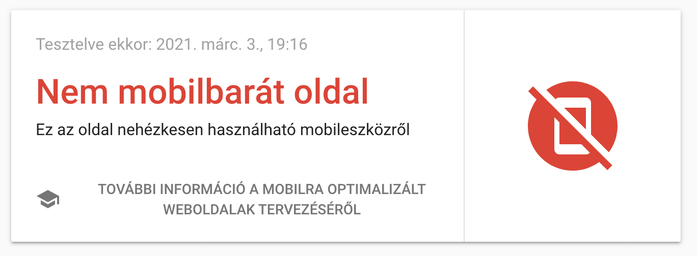
If it's not, we will see this screen:
Creating a mobile-friendly website or making your existing website mobile-friendly is incredibly important, so it's a good idea to ask professional professionals to do the job.
At Webcapital, it is precisely the design, development and maintenance of such web and content-based systems that takes place every single day, so if you are looking for a reliable, highly experienced team of experts, see our services.