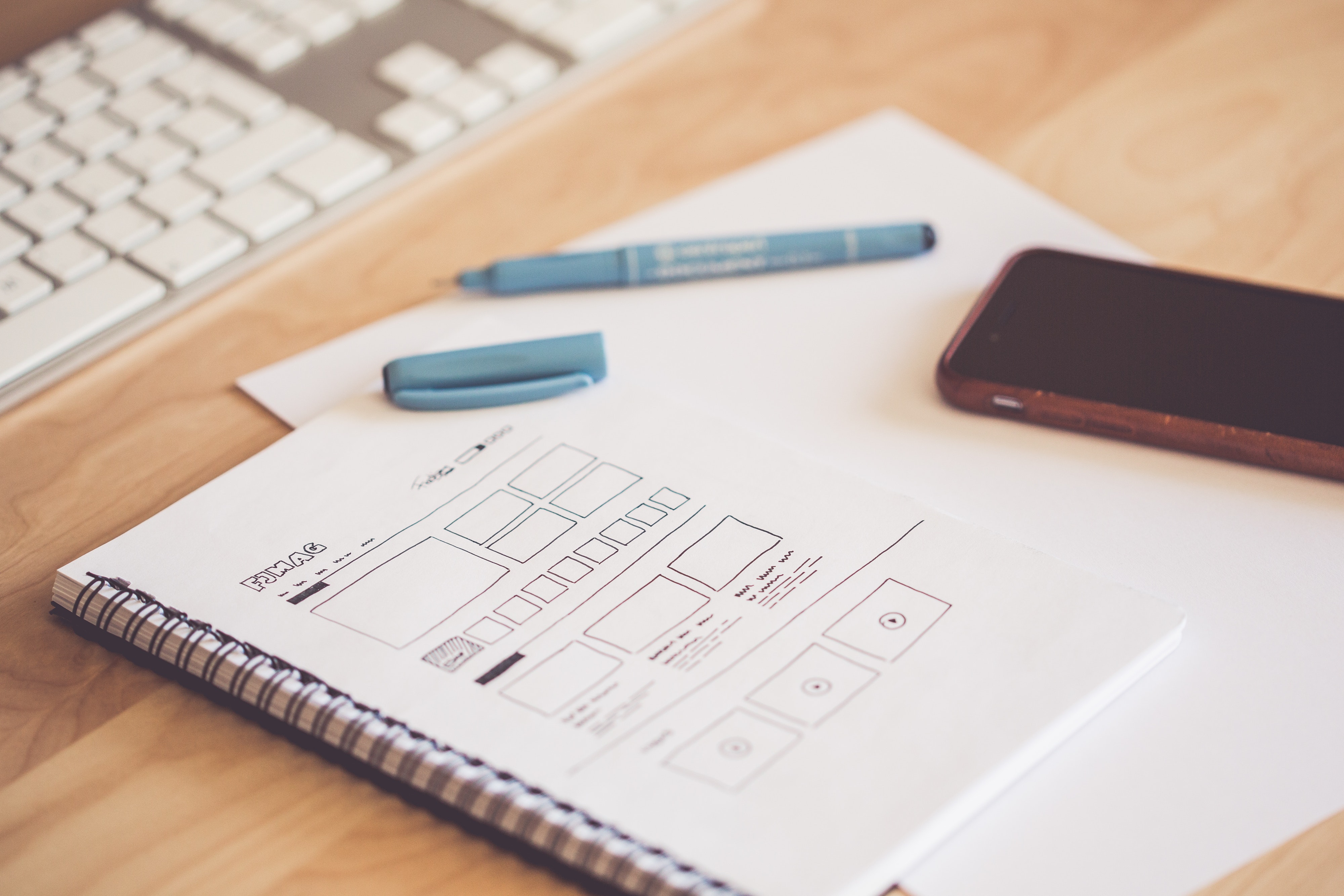
Why does your UX suck and what can you do about it?
Why does your UX suck and what can you do about it?
Let's say you are a web developer, and for better or worse, you have to spend some of your time working on user interfaces. So why not dive into some easy strategies that can help you with UX optimization.
Intro
In a typical web development project, interface development can happen either:
-
With the usage of an existing design and guidelines;
-
Or with your own experience and imagination.
I assume, at some point, you needed to work with one or the other. And I also assume that you know that both can lead to disastrous results. I am talking about those apps and pages that are radiating the worst kind of user experience.
Let's jump into some problems and solutions that can help you to be better in this.
Create with assertiveness in mind
This is one of the many topics of good UX design: What does it mean of understanding the pain points of an interface? Human beings are not very good at imagining how another human being behaves. Because usually, they work in egocentric ways. And that is why creating something that works for me is a receipt for the apocalypse.
A fundamental conflict in that is that we always develop for a certain moment in time. But the user has to face our product daily. We are already on holiday while the user sits in hell.
Also related to the topic of time, we tend to forget, that by creating with a focus on helping the user, we can save time. It is because we can be more assertive, so we don't need to rework the same page or functionality again and again.
Also, let’s not forget that what looks and feels easy for a developer does not feel the same for the user.
So what I am suggesting here is to make an effort to help the user by executing our work with the right mindset. (A fine example is using in-place editing so you don’t make the user navigate through 5 pages to update a label)
Imagine that you are the user
It’s common knowledge that we have to fulfill various roles in our life. In one moment, you’re a programmer, in another, you’re a user.
You have to access your financial institute's platform to transfer money. Your service providers’ platform to get bills, change contracts, etc.
It’s a constant war with bad UX design. So why not use this anger and put it to good use?
When you start working on your next big feature, stop for a moment. Try to remember what makes you nervous about the applications that you use every day. I am sure you have some ideas on how to make them better, and how to apply some solutions that can make a user happy. The best thing is, that those aren't complicated. Small, incremental changes can make a huge difference in every aspect of your work. Changes, like increased font sizes, font-weight, line-height, and so on.
The simpler, the better
One thing that I am convinced of is that the goal of good UX design is to understand your user.
You can start by eliminating the unnecessary elements. Those that make it painful to use your creation. For that, you have to stop and meditate on your work. But be aware, that simplicity does not resume in removing all the unnecessary elements of a page.
We have to make a constant effort not to fill up everything with functionality. It also means putting in elements that help users understand the interface. And do not forget the ability to guide them on a route to complete their journey.
So to finish the point, some examples would be:
-
information bubbles
-
descriptions
-
help tags
-
title attributes
-
meaningful icons (not taking the opportunity to tease about that).
Wrapping up
The effort of combining simple layouts with focused features pays out in the long term. This generates increased user satisfaction rates, so your boss will be happier.
Take note that good sense can help you in every aspect of your life. Using it will benefit the quality of your work, whether you own a certain skillset or not.
So do you have any suggestions for a better user experience that can help fellow developers?


